The same surface twice: what a screen shows, and what a hand holds.
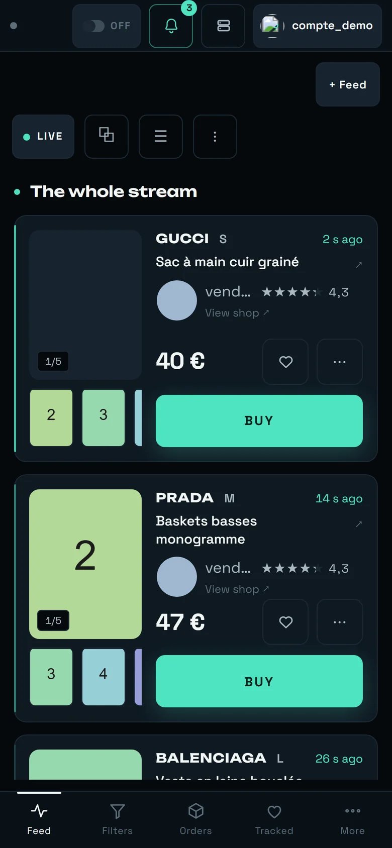
The stream on a 390 px phone: reduced header, one listing at a time, BUY across the full width, tab bar at the bottom.
BUY button —
never. The BUY button does not shrink at any point: on a phone it even gains a whole row, across
the full width of the card.The four widths
REGA knows four layouts, and they trigger on the width of the window — never on the type of device. Each tier keeps everything the previous one has already removed.Navigating with your thumb
The sidebar disappears entirely, and seven navigation entries do not fit under a thumb: at 390 px each would fall below the minimum touch target, and nobody would read their labels. So REGA keeps four, plus a fifth button that calls up the rest.What disappears from the header, and why
The header is the most contested surface in the product: below 900 px there is simply not the room for everything it carries on a computer. Here is what gave way, in order. Below 900 pxScreen by screen
The feed
The feed: one single layout, the photo on the left, the thumbnail rail below, BUY on its own row.
Wall and Table are not offered. If you look for them,
REGA answers On a phone there is only one layout.
Below 900 px there is only ONE feed, always. REGA says so itself:
Only one feed on this screen — two bands would fall below the readable card width. An iPad held in
portrait is below that threshold: it too opens only one. Two feeds side by side are a computer thing,
and only where the measured width accepts them — when it does not, the screen says so
(One more feed would fall below the readable card width.) instead of shrinking the cards.
This is not a punishment: it is where the phone takes back what the old compact card used to
withhold. The photo becomes a far larger block, and the thumbnail carousel returns — the other photos
of a listing are reachable from the card, without opening it.
What the card gives up, and where to find it again:
Filters
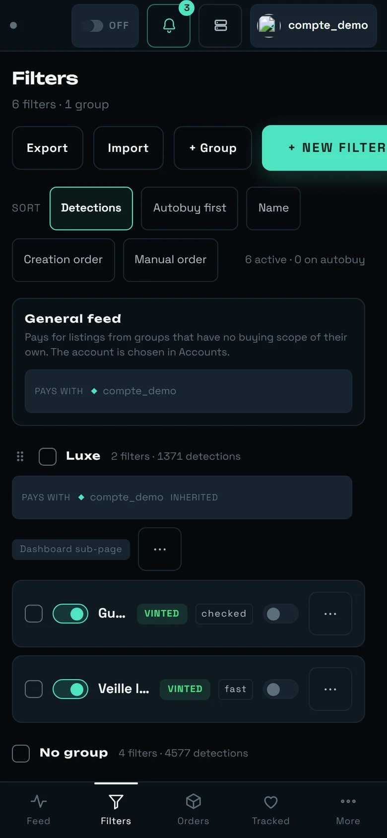
Filters: the summary and the cap fall, both switches stay.
- Below 1280 px: the heading of the autobuy column falls, the switch stays.
- Below 900 px: the detections counter falls (it informs); the grid drops to one column; the header actions take the full width.
- Below 599 px: the row summary and the filter’s cap disappear too. The name, the autobuy switch
and the
⋯never fall. - Every settings window sticks to the bottom of the screen and reserves room for the phone’s home bar.
Orders
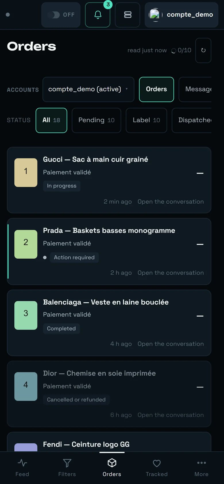
Orders: the rows of filter chips scroll in place instead of stacking onto five lines.
- An order row goes from 4 rows to 2.
- The Kanban stacks: its eight columns cannot be read side by side at that width, so it is presented one column per row.
- The conversation thread becomes a panel you call up, instead of a column.
- Below 700 px, the link to a pick-up point’s map falls — the parcel count and the waiting marker stay visible, they are the only two pieces of information that decide whether you travel. It is the address that gets abridged, never them.
Tracked
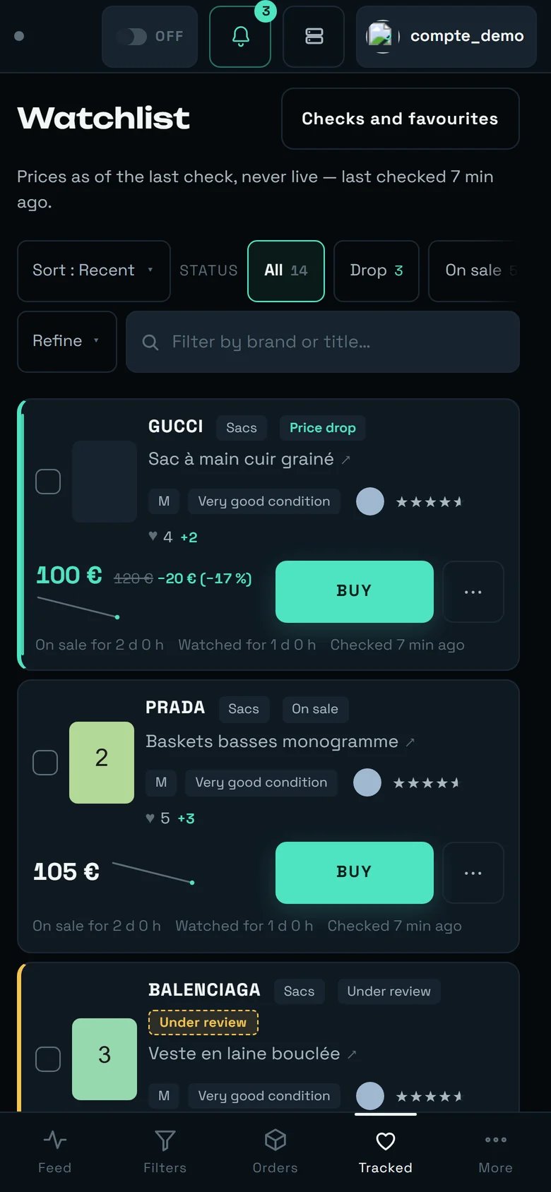
Tracked: the Refine button stands in for brand, category and price bounds.
- The layout selector is not rendered at all.
Gridneeds 760 px,Tableneeds 1100: at 390 px onlyListwould remain, and a selector with one entry is a dead control. REGA does not hide an unavailable option: it does not offer it. - If you shrink the window below the floor, the display falls back to
Listwithout erasing your choice: it returns as soon as the room returns. - Brand, category and price bounds move behind a
Refinebutton, whose tooltip readsBrand, category and price bounds. When filters are active, it gives their number. - The card goes from 7 rows to 3. Nothing is removed: what was stacked is laid side by side. You see three tracked items at once.
Sales
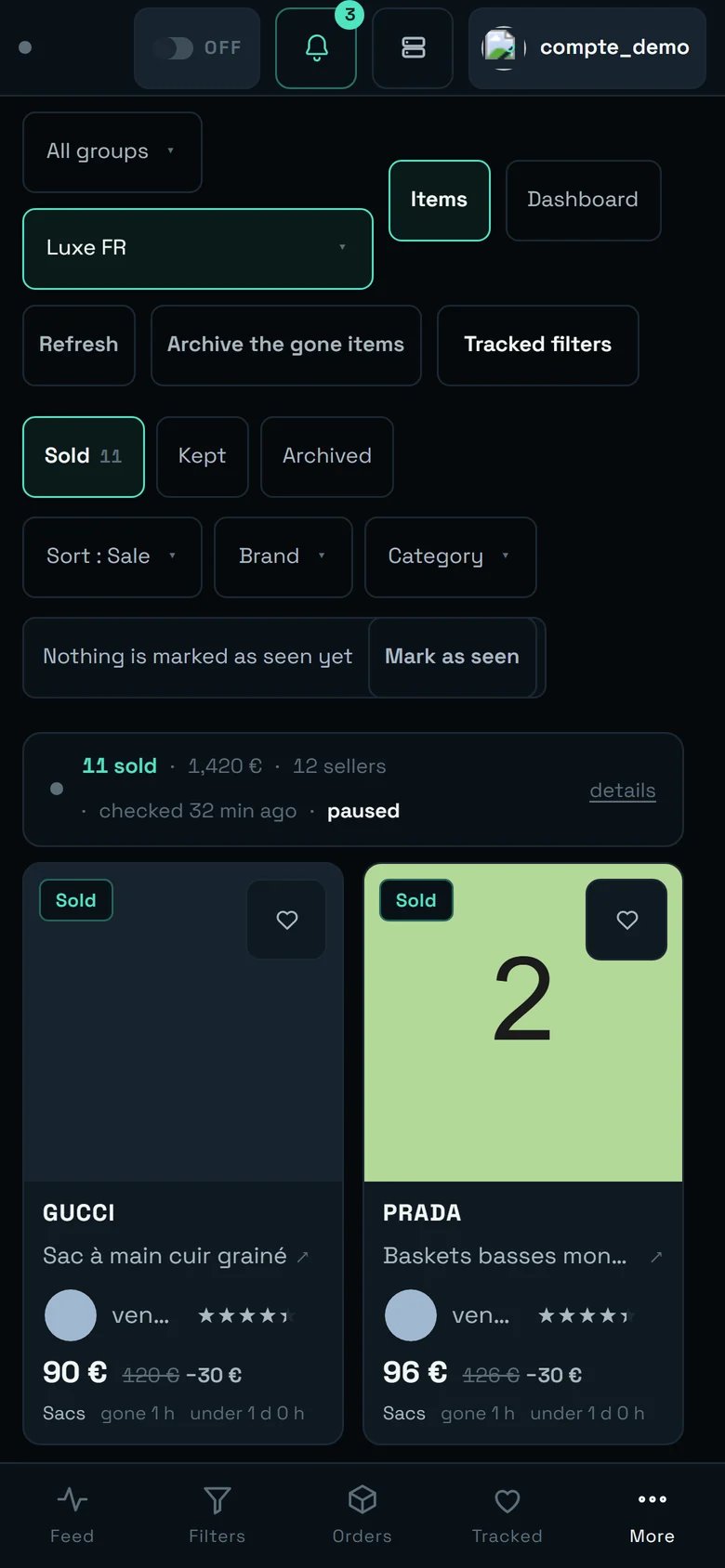
Sales: the photo stops being portrait, two cards fit per row.
◂ the table scrolls sideways ▸. It is hidden
everywhere else, and shows up only at the width where the overflow is real.
Accounts
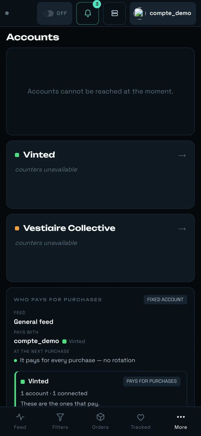
Accounts: the list alone. An account's detail sheet takes the whole screen, and an arrow brings you back here.
← Back to the list.
The two marketplace doors (Vinted, Vestiaire Collective) stack below 719 px: a half-width door on a
phone becomes a target you miss. And a group’s member list is capped at 48 % of the screen height —
otherwise it would stop you reaching the save button.
Stats
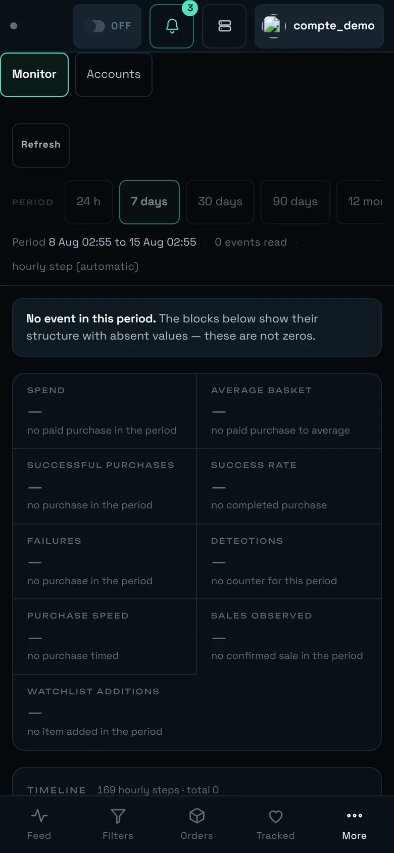
Stats: no screen title, the periods scroll on a single row.
Settings
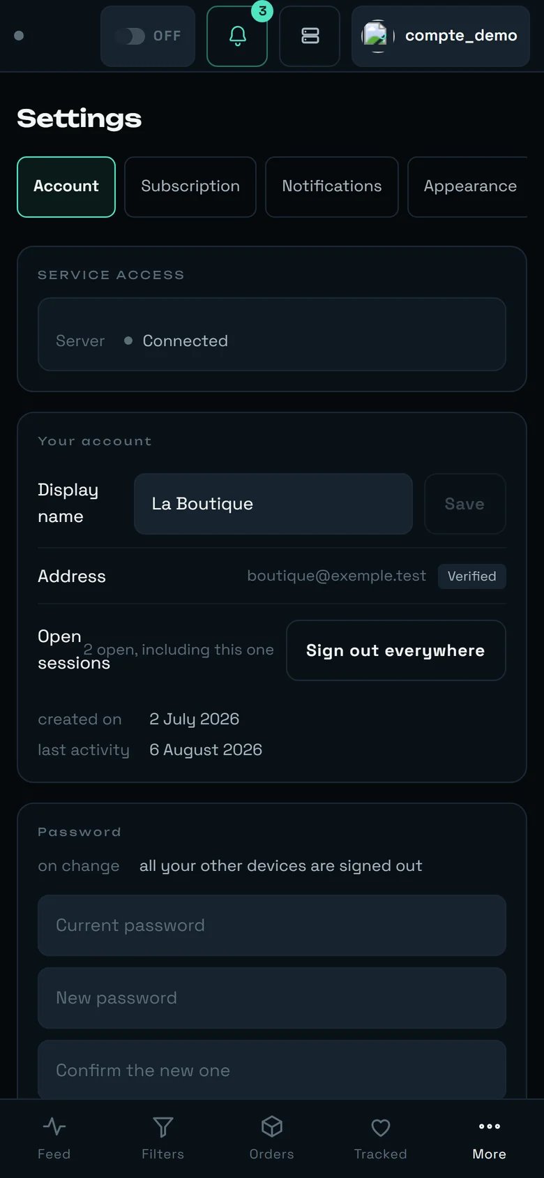
Settings: the sections scroll on one row, the setting rows get more breathing room.
Menus, windows and targets: what changes everywhere at once
These three rules apply on every screen as soon as you are on a touch screen or below 900 px. They explain most of the surprises.Menus come up from the bottom
⋯ menu, a selector, a list of choices: everything opens stuck to the bottom of the screen,
where the thumb is — never underneath the button you just tapped.Windows become sheets
Everything becomes reachable by finger
A tall, narrow band of light standing in the dark — the shape a screen takes once it is held in one hand.
Money, from a phone
This is the section to read twice. Nothing that follows depends on screen size, but all of it takes on a different meaning there — because a phone locks, goes into a pocket, and loses signal.Automatic buying runs on our servers
AUTOBUY switch from your phone arms the server. It survives closing the tab,
closing the browser, switching the device off. The line Where automatic buying runs —
on our servers — closing the tab does not stop it — states that fact; it is not a switch you
set. The only gesture that stops it is disarming it.Three distinct ceilings, from the widest to the narrowest
Purchase ceiling (Settings → BUYING) applies to every purchase, manual and automatic, on
every machine — Above this amount, the purchase is refused and you are told. Empty = no ceiling.
It is empty by default, and once set it also refuses an item whose price cannot be read. ·
Cap per item lives in the dashboard’s AUTOBUY panel, is 120 € by default and is
remembered only in that one browser. · A filter’s cap only bounds that filter’s automatic
buying.The pick-up point: two things not to confuse
Automatic pick-up point (Settings) is on by default, and its text is blunt: rega chooses the collection point during the purchase. Turned off, the purchase fails for want of a pick-up point — leave it on. Turned off, the purchase fails with
No pick-up point could be selected for this order. — nothing asks anyone anything. That is a
different thing from PREPARE THIS CARRIER (Accounts screen), which is a REAL purchase of a few
euros, once per account and per carrier, and which remains optional.An interrupted payment is never replayed
Orders and look, before retrying anything.PREPARE THIS CARRIER saves ~1.3 s on every later purchase shipped by that carrier, and that
gain is not additive: it is the seller who picks the carrier. Preparing several widens the
share of your purchases that gain that time; it never increases the gain itself.Drop alerts: the only chain that matters
A phone without alerts is just one more screen. Here is the complete chain, and the two places where it breaks in silence.Tick “Notify me” on the filter — nowhere else
Only fires for the filters that asked for it — the switch lives on each filter.
Its help text, inside the filter window: One notification on every detection by this filter — photo, brand, title and price. No cap is applied: a wide filter will produce a lot of them.Switch the device on
Notifications → This device → Switch on for this device. The button
Asks the browser for permission, then registers this device. The state you want is
Device switched on ✓. Every phone, every computer is switched on separately.On iPhone: add rega to the home screen, or nothing arrives
On iPhone, alerts require adding rega to the home screen (Share → Add to Home Screen), then opening it from there. Do it, then reopen REGA
from the icon.Check it really worked
DEVICES AND CONNECTIONS. The Mode row must read Installed on the home screen and
not Browser tab. The Alerts row must read Allowed.What you cannot do from a phone
Said plainly, so you do not go looking for it.Splitting the work
The right way to use REGA is neither “everything on the phone” nor “everything on the computer”. It is a split, and it follows directly from what each width can do.Our advice
1. Add rega to your home screen, even if you are not on an iPhone
1. Add rega to your home screen, even if you are not on an iPhone
DEVICES AND CONNECTIONS that Mode reads
Installed on the home screen.2. A drop alert takes THREE switches, not one
2. A drop alert takes THREE switches, not one
Notify me), the device (Switch on for this device), and the alert type. Forgetting
one gives you a silence you cannot diagnose — and then you believe the product is broken. If
you hear nothing, go back over all three in that order before any other hypothesis.3. Only tick “Notify me” on your narrow filters
3. Only tick “Notify me” on your narrow filters
4. Arm AUTOBUY when you go out walking — you gain two things
4. Arm AUTOBUY when you go out walking — you gain two things
5. Give your accounts short names — eight useful characters
5. Give your accounts short names — eight useful characters
6. Set your money bound in the right place
6. Set your money bound in the right place
Cap per item does not follow you from device to device: set on your computer, it
does not exist on your phone. The bound that applies everywhere is the Purchase ceiling in
Settings; the one that bounds an automatic purchase is the filter’s cap
(Cap per item — leave empty to impose no cap). Set them from the computer, once.7. On a phone, leave the density on “Comfortable”
7. On a phone, leave the density on “Comfortable”
Compact is not more compact
here — the phone tier already tightens the margins, and the compact setting gives some of them
back. The setting that really shows more cards is a different one: Text size → Compact
(More listings on screen).9. Switch the language once, from any device
9. Switch the language once, from any device
The interface, the messages and the e-mails. It is in Settings → APPEARANCE, and nowhere else.10. Prepare the carrier once, from Accounts — then forget about it
10. Prepare the carrier once, from Accounts — then forget about it
PREPARE THIS CARRIER is a real purchase of a few euros, once per account and per carrier. It is
optional: without it the purchase still completes, simply ~1.3 s slower on the items
shipped by that carrier. Do it on the Accounts screen, calmly — on a phone it is a master-detail,
one sheet at a time, and the ← Back to the list arrow brings you back.What surprises people
An iPad held in portrait is treated as a phone
An iPad held in portrait is treated as a phone
A 1024 px iPad Pro gets 44 px targets without being a “phone”
A 1024 px iPad Pro gets 44 px targets without being a “phone”
The Statistics screen title disappears entirely
The Statistics screen title disappears entirely
The word AUTOBUY disappears, but the switch stays — and it still speaks
The word AUTOBUY disappears, but the switch stays — and it still speaks
On a narrow screen, your second account shows only its pill
On a narrow screen, your second account shows only its pill
A vertical gesture scrolls the list, a horizontal one turns the photos
A vertical gesture scrolls the list, a horizontal one turns the photos
The error indicator sits at the bottom left, above the tab bar
The error indicator sits at the bottom left, above the tab bar
The limits, said plainly
- Sales caps out at 2 whole cards at 390 × 844. Four is out of reach without amputating the photo. To compare many sales, it is the same page on a wider screen.
- On a 320 × 700 screen, the watchlist shows only one card at a time. There is not quite the height for two, and we preferred not to amputate the card to gain one.
- Below 480 px, a seller’s review count disappears (their username stays). The threshold is on screen width, and it is an acknowledged stopgap rather than a design.
- The Vestiaire page is not linked from any navigation — not on a phone, not anywhere.
Going further
The dashboard
Filters
Orders
Settings
Accounts
The watchlist
Refine button does, and what the displayed prices are worth.