The screen where listings land the second they are born, and where you buy: what every control does, what can refuse it, and how to be faster than the other buyers.
This is the live shop window for everything the radar finds, on both marketplaces: a Vinted
listing appears the second it is born, a Vestiaire Collective one within seconds of the marketplace
validating it, and a BUY button sits on each of them. Everything else in REGA serves this screen.
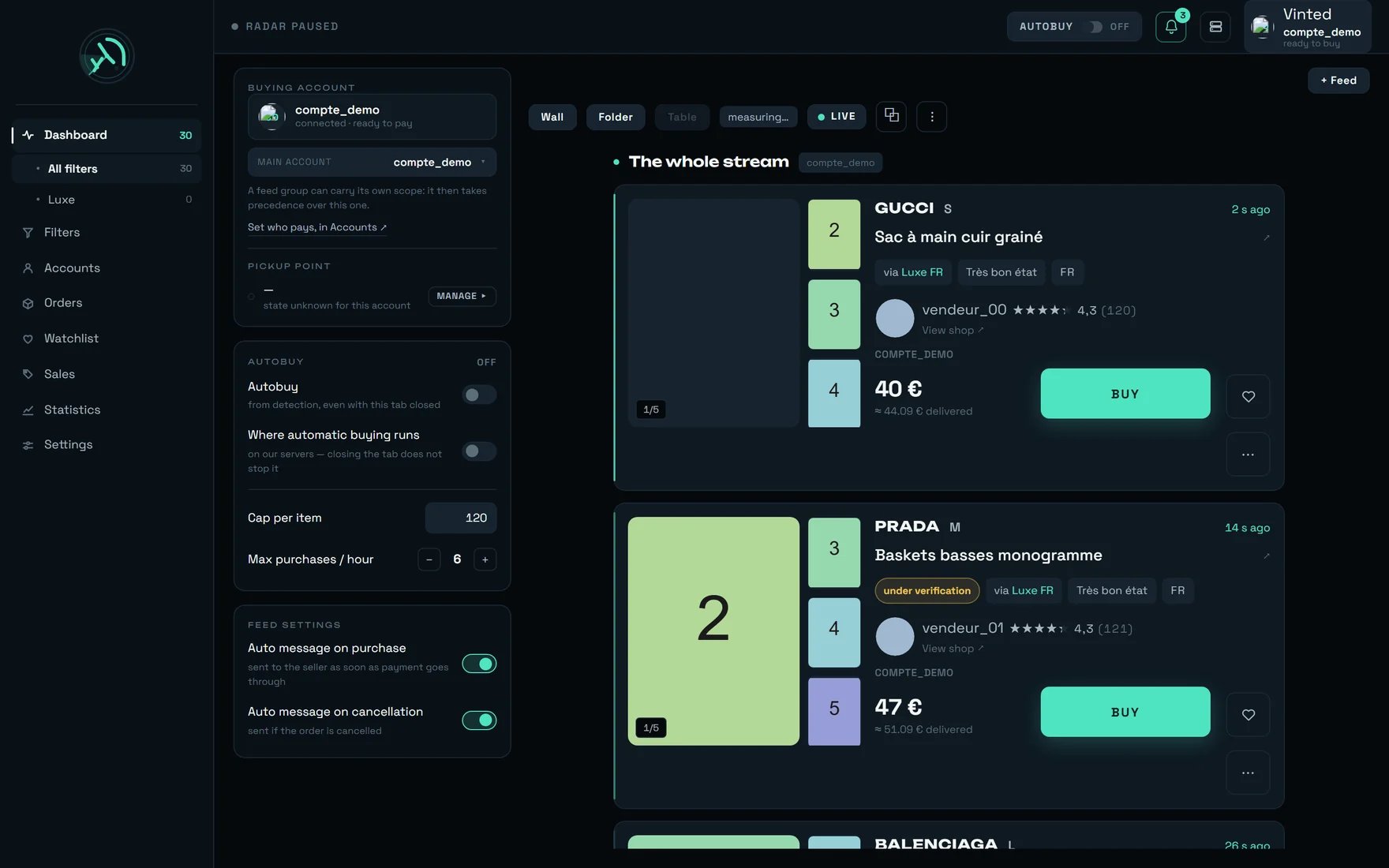
The dashboard on a populated account: settings on the left, the stream in the middle.
A complete card reaches the screen about a second after the listing is born on Vinted. You will
never watch that delay go by — what you see is the result.
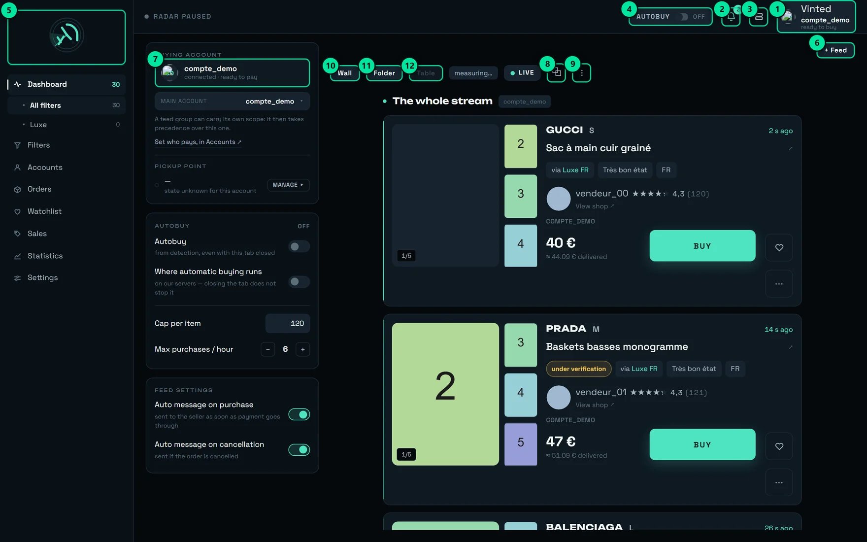
Tooltip: “compte_demo will pay for the next purchase — ready to buy.” This is the account that will pay, and therefore the address the parcel will go to.
2
The bell
”3 unread notifications” on our test account. This is where bank validation requests arrive.
3
Administration
REGA staff only — this button does not appear on your account.
4
The AUTOBUY badge (here “OFF”)
Tooltip: “Automatic buying disarmed”. One click arms automatic buying on our servers.
5
The logo
”rega — home”.
6
+ Feed
”Open a feed, or go back to the whole stream”.
7
The buying account card
”See this account’s delivery address and payment method”. Unfolds the address and the saved card.
8
⧉
“Open the general stream in a detached window”.
9
⋮
“Recent purchases and conversations”.
10
Wall
”Many listings at a glance, photo first”.
11
Folder
”One listing at a time, all its details”.
12
Table (greyed out in the capture)
“The table aligns its columns across the full width: it needs 1138 px…” — that is 1138 px of width for the listings alone, the window minus the side panels.
The Table button (12) is greyed out but still there, and it tells you why it refuses. That is the rule for
this whole screen: an unavailable control does not disappear, it explains itself. Always hover
before concluding something is broken — on this screen, nearly everything that looks broken carries
its reason in a tooltip.
Top left of the capture, the radar’s state: “RADAR ACTIVE”, “RADAR PAUSED” (that is the case here),
“RADAR UNREACHABLE”, or simply “RADAR” while it is not known yet. That indicator reports the
Vinted radar, and only it.
In the BUYING ACCOUNT panel, the sub-line must read “connected · ready to pay”. If it reads
“not connected — the purchase would fail”, nothing will go through. Unfold the account card
(badge 7) and check both blocks, ADDRESS and PAYMENT. Without an address and a card a
purchase cannot go through — and the screen says so in plain words.
Set a cap on every filter, not here
Filters screen → open each filter → the € max field. Left empty, the screen warns you
once: “No cap: this filter will buy whatever the price.” That is the only cap automatic buying
actually reads.
Arm the filter, THEN the AUTOBUY badge
Arming the badge is not enough: each filter is armed separately, in the Filters screen. After
arming one there, give it about twenty seconds before concluding that “it is not buying”.
Buy by hand once
Click BUY on a listing, then follow the line that appears in RECENT PURCHASES
(the ⋮ button). That line carries the truth: the account actually committed, and the total
debited.
Trigger a detection and check that a line appears
The ARMED badge on its own proves nothing. The only check that counts is a purchase line
appearing by itself on the first matching item — with its AUTO badge, “Triggered by autobuy”.
Prepare your carriers (optional)
PICKUP POINT panel → MANAGE ▸, or the Accounts screen. Vinted only remembers a
collection point after a first purchase actually paid via that carrier. Once per account and
per carrier, a few euros — and after that the purchase goes straight out.
”no account to buy with — sort this out in Accounts”
Nothing can go out.
”No delivery address on this account — a purchase cannot go through without one. It is set in the Accounts tab.”
Blocking.
”No card saved — a purchase cannot go through without one.”
Blocking.
”Card expired — replace it on Vinted before buying.”
Blocking.
MAIN ACCOUNT is the only editable setting in this panel: it names who pays. Going back to
“Every account · rotation” puts rotation back to work. The members are listed underneath, read-only,
with their state:
“compte_demo will pay for the next purchase”
“compte_demo is not connected — it will be skipped”
“compte_demo is excluded from this scope — it will never pay” — an excluded member stays visible
and struck through, otherwise the blacklist would be invisible from the very screen where it
prevents buying.
Refusals on this setting, quoted as they appear:
“Main account unreadable — the server is not answering. Nothing changed.”
“Setting out of date — who pays changed elsewhere. The screen shows the current state.”
“Main account not saved — nothing changed.”
“No account available to pay. Connect a Vinted account in Accounts.”
A feed opened on a group can carry its own buying scope: “A feed group can carry its own scope: it
then takes precedence over this one.” If your purchases go out from the wrong account, look at the
group first, not at this panel.
On our test account the panel shows “state unknown for this account” and a MANAGE ▸ button. Three
states are possible, per carrier:
State
What it changes
Ready
”the purchase goes straight out — about 1.3 s saved”
To confirm
”the point has not been reconfirmed recently — the purchase may be slower”
To activate
”the point will have to be chosen during the purchase — about 1.3 s more”
The screen explains it without dodging: “Vinted remembers a pickup point for each carrier. When it
does, the purchase goes straight out: about 1.3 s saved. Otherwise the point has to be chosen during
the purchase — and the purchase is that much slower.”
Preparing a carrier is a real purchase of a few euros, once per account and per carrier: “Vinted
only saves a pickup point after a first purchase actually paid via this carrier. This happens once
only.” The screen warns first: “This money is really spent.”It is optional — without it the purchase still goes through, simply ~1.3 s slower. And the gain
is not additive: the seller is the one who picks the carrier. Preparing several carriers widens
the share of your purchases that save those 1.3 s, never the gain itself.
Another setting has a similar name and does something entirely different: Automatic pick-up point,
in Settings → BUYING, is on by default and must stay that way. “rega chooses the collection
point during the purchase. Turned off, the purchase fails for want of a pick-up point — leave it on.”
Turned off, the purchase fails: nobody will be asked anything.
The panel carries four controls, and only one of the four acts on what really buys.
Control
What it actually does
The Autobuy switch — “from detection, even with this tab closed”
Arms automatic buying on our servers. It is the same switch as badge 4 at the top of the screen.
Where automatic buying runs — “on our servers — closing the tab does not stop it”
This is not a setting: it is a statement of state. It tells you where it runs. The switch does not flip.
Cap per item (120 € out of the box)
Remembered in this browser only. It does not bound the automatic buying that runs on our servers.
Max purchases / hour (6 out of the box, adjustable from 1 to 20)
Same thing.
The “Cap per item” field at 120 € does not bound your purchases. This is the most expensive trap
in the product: the only cap visible on the buying screen is not the one that decides. It is 120 € out
of the box and it is remembered in this browser only — another machine, a private window, and it is
back to 120.
There are three distinct caps, from the widest to the narrowest:
Cap
Where
Default
What it acts on
Purchase ceiling
Settings → BUYING
empty
Every purchase: human click, automatic buying, every machine. Once set, it also refuses an item whose price cannot be read.
Cap per item
AUTOBUY panel, here
120 €
This browser only.
A filter’s cap (€ max)
Filters → one filter
empty
Automatic buying for that filter.
REGA sets no price cap out of the box. That is an explicit decision by the owner of the tool:
visibility replaces constraint. If you want a bound, it is set filter by filter.
“Many listings at a glance, photo first”. One photo is loaded per tile; the others are one click
away in the viewer. Four columns are guaranteed as soon as the room exists, and a tile never
drops below 224 px. On a phone it is two columns, and it is the layout you get out of the box
there. This is the spotting view.
“One listing at a time, all its details”. This is the deciding view — the one in this page’s
large-screen captures. On a phone it is one card per row, with the photo across the full width.
“Compare several listings line by line”. Columns Item · Size · Condition · Price · Seller ·
Age, with headers that stay stuck at the top while it scrolls. This is the comparing view.
Table refuses on the width actually left for the listings, not on the size of your screen.
Measured: at a 1920 px window only 1004 px are left for the listings (panels and margins take
the rest) while the table needs 1138 — so it only appears from roughly 2054 px of window.
Widening the window can SHRINK the room available. Measured: at a 1279 px window, 1183 px are left
for the listings; at 1280 px only 712 are left, because the left panel comes back. To get Table:
fold the side panels away (☰ and ⋮), or move to the detached window ⧉, which docks none of
them.
On a phone the selector is there too, folded behind the handle described in the section “On a phone”
further down this page: Wall (out of the box, two columns) and Folder both work, and
Table stays visible and refuses in plain words — “The table aligns seven columns: they do not fit
on a phone.” The layout you choose on a phone is remembered on its own: it never overwrites the
one you use on a large screen, and the reverse is true too.
The figure followed by /min counts the listings the radar found, not the ones painted on screen.
Its tooltip says so: “This figure depends neither on the display being paused nor on how many cards
are kept on screen.” It counts Vinted only: Vestiaire detections reach the feed without ever being
added to it. Four states:
What is shown
What it means
a number followed by /min
The stream is running, and this is its rate.
”measuring…"
"First rate measurement under way…” — that is the state in our capture.
”radar stopped"
"The radar is stopped: no listing can appear."
"stream unreadable"
"The radar’s status did not answer — the rate cannot be measured for now.”
Always read the rate AND the backlog button together. A backlog growing under “radar stopped” does
not tell the same story as a backlog growing under a lively stream: the first is a leftover, the
second is a stream you paused without meaning to. The backlog button shows “42 NEW”, and caps at
“99+”.
The button switches between LIVE and PAUSED, with a badge counting what is waiting
(“12 listings waiting — resume the live stream”, or “No listing waiting — resume the live stream”).
There were once three different pause commands on this screen; only one is left. Learn that one and
only that one.What freezes the display, besides the button:
scrolling more than 40 pixels inside a band — silently, and deliberately: a card slotting in
under your cursor as you take aim is a real unwanted purchase;
opening a ⋯ menu or the full-screen photo viewer.
Freezing stops the painting, never the detection. Nothing is lost during a pause: listings keep
arriving, keep filling in, and automatic buying keeps firing. The band’s badge turns grey and says so:
“Display frozen — detection itself carries on”.
Opens the general stream in a 560 × 980 window, with no chrome and no side panels. It is the
monitoring tool for when you are working on something else — and it is also the shortest path to the
Table layout, since it docks no panel at all.
The detached window: no sidebar, no tab bar — the live dot, the stream's name and the × that closes it, in its header.
It has one way out, and it is new: a × (“Close”) in its header, which takes you back to the
home screen. It is faded with a mouse and brightens when you hover it or reach it with the keyboard;
at the finger it is fully visible. It exists because this window hides all three navigations: in the
app installed on a phone’s home screen — which reopens at its last address — a window with no exit
was a closed trap.Its address can be bookmarked: https://app.regasolutions.io/app/feed/?src=tout for the whole
stream. A feed opened in its own tab from a group or from a set of filters gets an address of its own
(?src=groupe&id=…, ?src=filtres&id=…).The ♥ works there on a Vinted card and on a Vestiaire card alike, and refuses a marketplace it
does not know instead of filing the listing anywhere: “This marketplace cannot be watched yet — the
watchlist covers Vinted and Vestiaire.”
Wall layout to spot (four guaranteed columns), then Folder to decide. You stay LIVE
and you do not scroll: you let cards come to the top and you take aim. This is the mode where the
40 px of scrolling matter most.
The permanent desk
Two or three bands opened with + Feed, pinned, with the buying scope checked band by band. The
layout is remembered: you find the same desk tomorrow morning. Feeds that no longer fit move to
tabs and carry on detecting.
Monitoring
The ⧉ window (560 × 980) in a corner of the screen while you work elsewhere, plus automatic
buying armed. You stop watching the screen: you watch the notifications and the RECENT
PURCHASES lines.
Every open feed gets a chip in the top bar — except the general stream, which has none. Each chip
carries a state (“paused”, “deleted”), a counter of new items, and a ⋯ menu: “Bring on screen”,
“Pin (keep on screen)”, “Unpin”, “Rename”, “Move left”, “Move right”, “Close this feed”.
A feed that moves to a tab is not switched off. The message says it: “One more feed would fall
below the readable card width. It stays as a tab and carries on detecting and counting.” Automatic
buying still fires there. Do not close it because it no longer fits on screen — pin what you want
to see permanently.
Open a group from the sidebar, or with “+ Feed”?
They are not the same screen. The sidebar opens a restricted page: a single band, no general
stream, no feed bar, and a “See the whole stream” link to get out. It is not remembered — a
reload brings you back to the full dashboard.+ Feed adds a band next to the general stream, and that one is remembered.For a permanent desk: + Feed. To look at a group for five minutes: the sidebar.
I lost the general stream, there is no chip for it any more
That is normal, it never had one — its chip repeated word for word the header of its own band a
few pixels below. A message told you the moment it left: “The whole stream left the screen — “+
Feed” then “All filters” brings it back.” That is exactly the way back.
I renamed a feed and its title no longer translates
Correct. A title you write is your data: REGA never translates it. The original title is “The
whole stream”.
A chip shows “deleted”
The group behind that feed no longer exists. The band stays open so you can decide what to do with
it; it does not close behind your back.
A surface cut into unequal zones, the light kept for the one in the middle.
The three layouts serve the same content: the marketplace the listing comes from, brand, title (a
link to the listing), photos, facts, seller, price, BUY, ♥, ⋯.
“Vinted is verifying this item: the transaction is not authorised yet. If it passes verification it becomes buyable again; if it fails it will be deleted.”
deleted
”This listing no longer exists on Vinted: it was deleted or withdrawn. This is not a sale — a sold item keeps its page. The purchase will not go through.”
GONE
”Withdrawn, reserved or bought by someone else — clicking BUY would not go through."
"via Luxe FR”
The filter that triggered this card. On a stream where several filters are running, it is the first thing to read.
category unverified · origin unverified
”The category of this item could not be verified in time. The card is shown so nothing is missed — it may therefore not match the filter, and automatic buying holds off.”
An item that is obviously off-topic in your stream is almost never a filter bug: it is that last tag.
REGA would rather show you one card too many than hide a good one — but automatic buying holds off.
If you want it, those cards are for buying by hand.
In the capture, the GUCCI card shows 40 € in large type, then ≈ 44.09 € delivered underneath.
These are not two versions of the same number.
40 €
The price written on the listing, in the seller’s currency. This is what all three caps
compare against.
≈ 44.09 € delivered
An estimate: item + buyer protection + delivery. When the exact postage is unknown, REGA adds
3.50 € — deliberately modest.
The tooltips say it: “Estimated total price: item + delivery (about €3-4). The exact postage depends
on the carrier chosen at purchase.” And when the seller covers postage: “Estimate: item + buyer
protection. Delivery paid by the seller.” The amount really taken only appears afterwards: “Amount
actually debited (item + delivery + buyer protection).”
Nothing is ever converted. An item listed at £10 shows £10, not an estimated euro figure: a
converted price would be a guess, and we do not print a guess where you read an amount.What that means in practice: set your filter caps on the item price, not on your total budget.
Measured buyer protection turns 10.00 € into 11.20 €, and measured real postage is 2.89 €. Count
~4 € above the displayed price, every time.
On a Vestiaire card there is one price, and one only: no “delivered” estimate is printed under it.
Printing our usual postage guess there would be inventing a Vinted delivery on a marketplace that does
not charge that way — and the gap between the two figures is far wider here. What a Vestiaire listing
really costs at the basket is on Buying on Vestiaire.
The button keeps exactly the same shape in every state — so the layout does not jump at the moment
you are aiming at the next card.
State
On the card
What it means
Free
BUY
Clickable.
Under way
”Purchase under way…” + bar
The bar is capped at 96%: it is not proof of payment. A purchase takes 6 to 9 seconds.
Bank validation
🔐 VALIDATE
”Your bank is asking for validation — open it and confirm the payment”.
Verification
”Under verification"
"Item under verification by Vinted — the purchase will start on its own as soon as it is verified.”
Bought
CANCEL
The purchase went through. The confirmation (amount, delay) lives in the tooltip.
Resumable failure
FAILED + RETRY, in red
The exact reason is quoted under the button.
Gone
”GONE — BOUGHT BY SOMEONE ELSE”
No RETRY, deliberately.
Outcome unknown
”TO CHECK — OUTCOME UNKNOWN”
No RETRY, deliberately.
“RETRY” disappears in four cases, and every disappearance protects your money: item under
verification (the purchase restarts on its own), outcome unknown (offering a retry means offering a
double charge), bank validation still in flight, and item GONE. On “TO CHECK — OUTCOME UNKNOWN”
the screen is explicit: “Outcome unknown: tracking stops here. Check in Orders BEFORE retrying — a
payment may still go through.”
A payment is never replayed after an interruption at the moment of paying: the outcome there is
unknown, and replaying would risk a double charge. That is the whole reason those buttons are missing.
♥ adds to your REGA watchlist (“Add to the watchlist” / “Remove from the watchlist”). It is local
to REGA and is never greyed out, whatever the state of the listing.The ⋯ menu carries five entries: “Add to Vinted favourites”, “Search this photo on Google Lens”,
“Follow the seller”, “Make an offer”, “Block the seller”. The Google Lens entry disappears when no
usable photo exists. Those five are the entries of a Vinted card; a Vestiaire card carries three,
and the next section lists them.
Google Lens on the photo is your two-second authenticity check — on a luxury brand at a price that
is too good, it is the cheapest move you have. And a trick along the way: opening that menu, or the
full-screen viewer, freezes the display by itself. It is the simplest way to study a card without
the list moving under your eyes; a menu left open releases itself after a minute.
An offer cannot go below −40 % of the price. The screen shows the floor in plain words before you
confirm: “Minimum offer” … ”— that is −40 % at most.”
On a seller the stream did not identify, the entry stays clickable and answers you honestly: “Follow
not possible — no account available to act”, or “Seller unknown — open the item to make an offer”.
Vestiaire Collective has no screen of its own, and there is nothing to go and open: its detections
land in this stream, in the same bands, on the same cards, with the same buttons. What tells them
apart is written in plain words on the card — “Vinted” or “Vestiaire”, always on both sides, never
one without the other: a missing tag would itself become the information, and an absence reads badly
at speed. The colour beside the word only confirms it, and hovering says “Vestiaire listing”.
Vestiaire detections in the common stream: the marketplace written on the card, and the three chips that decide which cards are painted.
Both / Vinted / Vestiaire — it changes what is painted, and nothing else
Three chips sit beside the rate figure — “Both”, “Vinted”, “Vestiaire”, under “Marketplaces shown in
the feed”. “Both” is the state out of the box, and your choice is remembered in this browser only.
This selector switches nothing off. Its own counter says so, and it is the sentence to keep from
this section: “The radar keeps detecting them and autobuy keeps handling them — this setting only
changes what is painted.” A “12 hidden” badge appears the moment it hides anything, so that a
shortened list is never read as a radar that stopped.
A band left showing a single marketplace, with nothing in it, says it in full: “No Vestiaire listing
yet. The feed is showing this marketplace only — the others are hidden, not lost: pick “Both” to see
them again.”
Yes — a Vestiaire line is kept apart from a Vinted one, even when both carry the same number
⋯ “Search this photo on Google Lens”
Yes
Yes
⋯ the marketplace’s own favourite
”Add to Vinted favourites"
"Add to Vestiaire favourites”
⋯ the offer
”Make an offer” — needs a seller the stream identified
”Make an offer on Vestiaire” — no seller needed
⋯ “Follow the seller”, “Block the seller”
Yes
Absent — not greyed out: absent
RETRY after a failed purchase
On a resumable failure
Never
Everywhere else on this screen an unavailable control stays visible and explains itself. The two
seller entries do the opposite on a Vestiaire card: they are not there at all. The rule is not
broken — a control explains itself when it could apply, and a gesture the marketplace does not have
is not a refusal but a gesture that does not exist. The favourite, for its part, does not toggle:
“Hearts the listing from your Vestiaire account. No effect if it was already there, and it cannot be
removed from rega.”
Three facts only a Vestiaire card carries appear in the same row of chips as the condition and the
country: a discount announced by the marketplace (“30% discount shown on the listing.”); a “partial
info” mention when part of the listing did not come back (“Some details are missing for this listing —
condition, size, material or category. Open the listing to see them.”); and a SOLD tag frozen at
discovery — “Already sold when it was found. This state is never refreshed: a listing sold later will
not say so here.”
BUY on a Vestiaire card does not fire a purchase: it opens a window titled “BUY ON VESTIAIRE”,
carrying the marketplace, the brand and the title of the item — and a warning placed before the
first click.
Quoted as it appears: “Two steps, and neither is automatic: preparing arms this account’s cart on
Vestiaire (and empties whatever was in it), paying opens your bank’s validation. The charge comes from
your answer, not from rega.”Two things in that sentence cost money if you skip them. Preparing empties that account’s basket —
the basket belongs to the whole account, never to one item. And the bank always asks: the payment
leaves on your answer, not on ours. The whole tunnel is on
Buying on Vestiaire.
Once the purchase is running, the card’s button behaves exactly like a Vinted one — the progress bar,
the bank link, ”✓ BOUGHT” — with the single exception of RETRY, which never appears here.
“Make an offer on Vestiaire”, in the ⋯ menu, opens a window titled “MAKE AN OFFER” which reads the
floor from the marketplace before letting you type: “Minimum offer accepted by Vestiaire: …”. One
click, whole euros, no seller required — and the floor rises with every offer and never comes back
down. Read Making an offer before your first one: it is the page that says what
an accepted offer does, and does not, reserve.
A Vestiaire payment left open comes back to the very top of the dashboard, above everything else
on the screen, titled “Your bank is waiting for your confirmation” or “A Vestiaire payment is under
way”, with the amount and two buttons — Resume and Cancel payment.Deal with it as soon as it appears: “While this payment waits, no other Vestiaire purchase can go out:
the basket is shared across the account.” One unfinished payment therefore blocks every other
Vestiaire purchase from that account, and “Cancel payment” is what frees it — “Closes this payment and
empties the Vestiaire basket, so the account can buy again. The item will no longer be reserved for
you.”
There is nothing to arm for Vestiaire. No badge, no button: one active Vestiaire filter is the
request itself, and the watch starts from it. So when no Vestiaire detection reaches your feed, the
question is never “did I arm it” — it is whether a Vestiaire filter is active in the Filters
screen.
When your bank asks for a validation, a banner appears at the very top of the screen: “Bank
validation requested for” + the brand + ”— the purchase is not paid until it is done.”, with a
VALIDATE button.It is global to the screen, not attached to a card: at the moment the bank asks, you may be
looking at another feed, and the card concerned may already have left the screen.
You have 15 minutes. Past that, the purchase is lost — with no charge, but lost. Leave the
bank validation notifications on, accept them on your phone, and stay reachable for a quarter of an
hour after a purchase. A reminder can be sent between 1 and 15 minutes after the request.
Three bands can sit at the very top — which is which
The bank validation banner is not the only band that can appear above the stream. Two others exist,
and they belong to the whole application, not to this screen: they are painted above the header,
on every screen, from the moment you are signed in. Telling them apart takes two seconds — one asks
nothing of you, one asks for a click, one asks for a decision within a quarter of an hour.
The band, from the top down
What it looks like
What it asks of you
The announcement
A single line, stuck at the very top, above the header. ”▲” on amber for an alert, ”●” in the ordinary colour for information. No button, no cross, no link.
Nothing. It goes away by itself.
The new version
”A new version is live” + “This tab is still running the previous version and some screens may stay empty. Reload whenever it suits you — nothing you have saved is lost.” + a Reload button, on a green-blue background.
One click on Reload, when it suits you. It never reloads on its own, and it does not close.
The bank validation banner
”Bank validation requested for” + the brand + ”— the purchase is not paid until it is done.” + VALIDATE. Part of this screen.
VALIDATE, within 15 minutes — see above.
The announcement always sits above the version band, and both sit above anything the screen
itself paints — the bank validation banner and the Vestiaire payment banner included.
The announcement band, alert tone, on the dashboard: one line above the header, and nothing to click.
It is a message from REGA to all its clients, written by hand at the moment it is needed — for
instance during an outage on the platform’s side: “Vinted is currently down for everyone. REGA will
resume automatically as soon as Vinted is back.” The wording is not fixed: it is what REGA has to say
at that moment, in a few lines at most.
Amber with a ”▲” means something is not working on the platform’s side; ”●” in the ordinary
colour means something worth knowing. Neither has anything to click.
There is nothing to do. The band cannot be dismissed, and it does not need to be: it disappears
on its own when REGA switches it off, or when the deadline REGA gave it passes.
Allow up to two minutes. The band is read when a screen opens, then every two minutes: it can
appear up to two minutes after REGA posts it, and stay up to two minutes after it is switched off.
Reloading the page reads it at once.
It follows the language you saved with the FR / EN selector in the header — at the next
reading, or on reload, not at the instant you switch. If you never picked one, it comes in French.
And if REGA wrote it in one language only, you read that one: a message in the other language is
better than no message.
It is only there once you are signed in. The sign-in page never shows it.
It is also filed under When something refuses, so that you find
it the day you go looking for a refusal rather than a banner.
Opened with ⋮, or docked on the right of the screen when the window is wide enough and there
is still room for the listings. It carries the last 12 lines, most recent first, with a total in
the header (“Purchases paid in this session”).Empty: “No purchase in this session — the full history is in Orders.”
The total sums only completed purchases. Adding purchases still under way would give a total that
goes down when one of them fails — a counter that goes backwards is a counter nobody believes.
This, and nowhere else, is where you read which account actually paid. The name shown on the card
at click time is only a forecast: the server picks and reserves the account, and the answer may
name another one. To know which address a parcel leaves from, read the purchase line — and its amount
slot, which first says “item price — total not confirmed yet”, then “total debited”.
Below that, the conversations. An open thread takes the whole column — at 330 px wide, a floating
panel would cover exactly what you need to keep in sight.
It is the most frequent question, and it almost always has one of these five answers.
An emptied account group does not buy — and that is deliberate
“No account” and “no restriction” are not the same thing. A group you deliberately emptied
refuses the purchase instead of falling back on any account at all: a loud refusal beats a
purchase from the wrong account, and the opposite cannot be undone. If your automatic purchases
stop for no visible reason, look at the feed’s account group first.
An item detected more than 2 minutes ago is no longer bought
This is not a cap, it is freshness: an item detected several minutes ago is almost always gone.
After an outage, nothing will be bought “late”.
Arming a filter does not buy what is already on screen
Without that rule, arming a filter would immediately buy everything lying around in the list. Only
fresh detections are bought automatically.
Everything is armed, and the screen stays empty
Look at the rate. “radar stopped” means what it says: “The radar is stopped: no listing can
appear.” And a band showing “No recent detection on this source — the radar is sweeping.” is
working perfectly: your filters are simply too narrow for now.
Set your caps in the FILTERS, never in the AUTOBUY panel
The “Cap per item” field at 120 € on this screen does not bound the automatic buying that actually
runs, and it does not follow you from one machine to another. The only portable, working cap is
each filter’s € max. Sort the filter list by “Autobuy first” and check the cap column line by
line: the ones showing “no cap” will buy at any price.
Set that cap on the ITEM price, not on your budget
All three caps compare the ITEM price, never the total. With buyer protection and postage, count
roughly 4 € more at the charge (measured: +4.09 €): a cap set at 100 € therefore lets through
a purchase charged at around 104 €. Set your caps to the item price you accept, not to your total
budget.
After arming a filter elsewhere, count 20 seconds before concluding
A filter armed on another screen takes about twenty seconds to count here, and a feed just
created a little longer. Until then, nothing is armed — deliberately: better not to buy for
one second too long than to buy what was never armed.
Do not scroll during a burst — pause, or click the backlog
Scrolling more than 40 px freezes the display without saying so, and that is a protection: a card
slotting in under your cursor is an unwanted purchase. If you want to read calmly, pause on
purpose: detection and automatic buying carry on. To resume, the backlog button brings everything
in at once and puts the list back at the top.
Two screens beat one big one
The ⧉ window (560 × 980) sits in a corner while you work elsewhere, and it docks no panel — it
is also the shortest path to the Table layout, which needs 1138 px for the listings alone.
Pin instead of closing
A feed moved to a tab carries on detecting, counting and buying. Closing it deletes it. Pinning it
keeps it on screen whatever happens to the window width.
Google Lens before buying a luxury piece that is too cheap
Two seconds, in the card’s ⋯ menu. And the open menu freezes the display: you can study without
the list moving.
Prepare the carriers of your recurring sellers, not all of them
Each preparation costs a real purchase of a few euros and returns ~1.3 s on purchases shipped by
that carrier. Since the seller is the one who picks it, prepare first the ones you see coming
back in your streams. The gain does not add up: it widens.
Stay reachable for a quarter of an hour after a purchase
Bank validation is the only moment the tool needs your hand, and it expires in 15 minutes.
Leave the matching notifications on, and accept them on your phone.
On “TO CHECK — OUTCOME UNKNOWN”, go to Orders before clicking again
The missing RETRY button is not an oversight. The payment may still go through, and a second click
would be a second purchase on a transaction that may already be paid.
Do not buy over an item that is “under verification”
Vinted takes the listing out of the catalogue while it checks it, for 30 minutes to 2 hours,
and does not allow the transaction until then. The item is not lost: the purchase restarts on
its own as soon as it is validated, and the queue gives up after 96 h. Do not buy over it
while you wait.
Empty your verification queue before a weekend
It gives up after 96 hours: four days during which a purchase can go out on its own, with no
new click. Orders screen → the verification purchase queue → remove what you no longer want.
“Remove from the queue” is not a cancellation: nothing was paid.
Do not read a failure as a breakdown
Most failures are races lost, or items that had already gone — not breakdowns. The screen files
every failure under a verdict — “Race lost, or the item had already gone”, “Postponed — the
purchase will be retried”, “For us to fix”, “Waiting for something from you”. Only react to the
last two.
Close the tab without worry — but know what that does not stop
Automatic buying runs on our servers. Closing the tab, closing the browser, shutting the machine
down: none of that stops it. The only move that stops it is disarming the AUTOBUY badge.
The AUTOBUY badge is armed although I have just reopened the app
That is the point. The state lives with us, not in your browser: it survives closing the tab, the
browser and the machine. A badge found armed when reopening the app is not a bug — it is the proof
that automatic buying never stopped running.
The “Where automatic buying runs” switch is off, yet it is buying
That switch states a fact, it does not set it. Its description tells the truth: “on our
servers — closing the tab does not stop it”. There is nothing there to flip.
The right-hand panel disappears when I WIDEN the window
That is the cure, not the fault. Docking is decided on the room left for the listings, never on
a window threshold. Without that rule, widening by 20 px could take the wall from 4 columns to 2.
The panel stays reachable through ⋮.
A band has no item counter
It existed, and it was removed after measurement: it counted painted cards, capped at 200, so it
stayed stuck on 200 as soon as the stream was lively. A counter that no longer moves informs
nobody.
A card disappears from a band although it was displayed
It came in as a precaution, and the truth arrived ~3 seconds later: none of your filters keeps it.
It leaves the bands — but not the memory: if you had opened its detail page, it still reads.
“✓ BOUGHT” does not appear on the card
On the card the button becomes CANCEL directly: that is the useful move at that instant. The
purchase confirmation (amount, delay) stays in the tooltip. In the detail page, where there is
room, both fit together.
The progress bar never reaches the end
It is capped at 96%: a purchase takes 6 to 9 seconds, and the bar cannot know in advance
which. A full bar would not be proof of payment — the proof is the purchase line.
A failed purchase still used up its turn in the rotation
The account is committed at reservation, so before the outcome. That is deliberate, and it is
also why “RETRY” starts again on the next account: an account that has just failed is the worst
placed to try again.
A disconnected account stays visible in the payer list
It is not taken out of the rotation: it is skipped, and its tooltip says so — “compte_demo is
not connected — it will be skipped”. Hiding it would suggest it no longer exists.
“RECENT PURCHASES” mixes several paying accounts
Deliberately: the payer rotates. Filtering on the current account would make the purchases of
previous rotations disappear — that is, half of what you are looking for.
Two purchases can go out at the same time on the same account
Two, not one: that is the limit. On the third, the screen answers “A purchase is already under way
on this account.” With several buying accounts, the simultaneous spending window is two per
account.
On a phone the layout selector is back, with one chip that refuses
It had been removed when a phone had a single layout: a selector with one option is not a
selector. A phone now has two — Wall and Folder — so the selector is a selector again,
and it follows the rule of the rest of the screen: Table stays visible and says why it
refuses, “The table aligns seven columns: they do not fit on a phone.” At rest it costs no room:
it is folded behind the handle with the other controls.
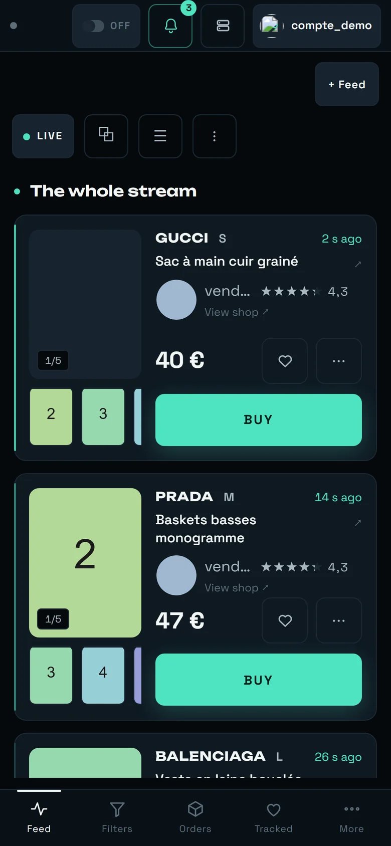
The dashboard on a phone: Wall layout, two columns of tiles, the controls folded behind the handle under the header.
What changes:
A single band, in the Wall layout out of the box: two columns of tiles, the photo first.
Folder is still there — one card per row, the photo across the full width — and Table
refuses, in plain words: “The table aligns seven columns: they do not fit on a phone.” The layout
you choose on a phone is remembered on its own: it never overwrites the one you use on a large
screen, and the reverse is true too.
The controls are folded behind a handle, the thin bar just under the header. Behind it:
+ Feed, the layout chips, the Both / Vinted / Vestiaire chips and the backlog button. One
tap shows them all, on one line that scrolls sideways; a second tap folds them back. The handle
announces its own state — “Show the controls”, then “Hide the controls” — and that state is
remembered screen by screen, in this browser. Nothing has been taken away: measured, 117 px above
the list instead of 264.
Still no rate figure — there is not enough room. ⧉, ☰ and ⋮ are still there:
settings go through ☰, recent purchases through ⋮.
At the bottom: Feed · Filters · Purchases · Watched · More.
BUY takes the entire row under the price — the one geometry where there is no risk of hitting
the wrong target. The facts of the item (size, condition, country) sit under the photo instead
of covering it; the “5 photos” counter stays on the image.
No arrows on the photos. At the finger, the ‹ › arrows do not exist: you swipe the photo
sideways — left for the next one — and the “3/12” counter stays. A swipe can never trigger a
purchase. With a mouse, the arrows are unchanged.
The list is drawn as you go: what fits on two screens first, the rest as you scroll. And the
40 pixels of scrolling that freeze the display on a large screen freeze it here too.
The same screen with the handle unfolded: + Feed, Wall · Folder · Table, Both · Vinted · Vestiaire, on one line.
An iPad in portrait (744 to 834 px wide) gets the phone layout. That is decided on width alone, and it
is owned.
No listing publication date is shown. The time you read (“2 s ago”) is the moment REGA
detected the listing. A publication date does not exist reliably anywhere in our data: relistings
pollute the timestamps.
The detail page’s description is a 400-character extract, taken at the moment of detection. It
can legitimately be missing — the page then says so: “This listing has no description, or it was not
there yet at the moment of detection.” — and points to “the listing ↗”.
No bank card form, and there never will be: the number is encrypted by the payment provider
inside Vinted’s own browser page. The address is changed in Accounts.
200 cards maximum are kept on screen. Beyond that the oldest leave: the full history lives in
Orders.
“RECENT PURCHASES” is not a history: 12 lines, current session. A line recovered from an earlier
session offers no “RETRY”.
~5% of listings will never have a photo. It is not slow loading: “it arrives about a second
after detection, and 5% never have one.”
Cap per item and max purchases / hour do not follow you from one machine to another.
No screen reports the state of the Vestiaire watch — not its passes, not its delay, not its
refusals. The radar indicator and the /min figure count Vinted only. What tells you the
Vestiaire watch is working is your detections arriving.
A feed opened in its own tab does not carry the Vestiaire gestures. In the focus window,
BUY on a Vestiaire card does nothing at all, the offer answers “Seller unknown — open the item
to make an offer”, and neither the marketplace chips nor the payment banner are there. For anything
Vestiaire, stay on the dashboard.
The detail page of a Vestiaire listing has no ♥, although the ♥ on its card works — and that
page does not say which marketplace the listing comes from.
This is where automatic buying is armed, filter by filter, and where the only cap that counts is
set.
Accounts
Who pays, with which address and which card — and carrier preparation.
Orders
The full history, the verification queue, and where to check an unknown outcome.
Settings
The purchase ceiling, the automatic pick-up point, and bank validation notifications.
Buying on Vestiaire
What preparing really does, the basket shared across the account, what an item costs once the
marketplace has added its lines, and the bank confirmation that is always asked for.
The Vestiaire marketplace
Why a listing is born by hand there, what an active filter arms, and what no screen shows of that
watch.